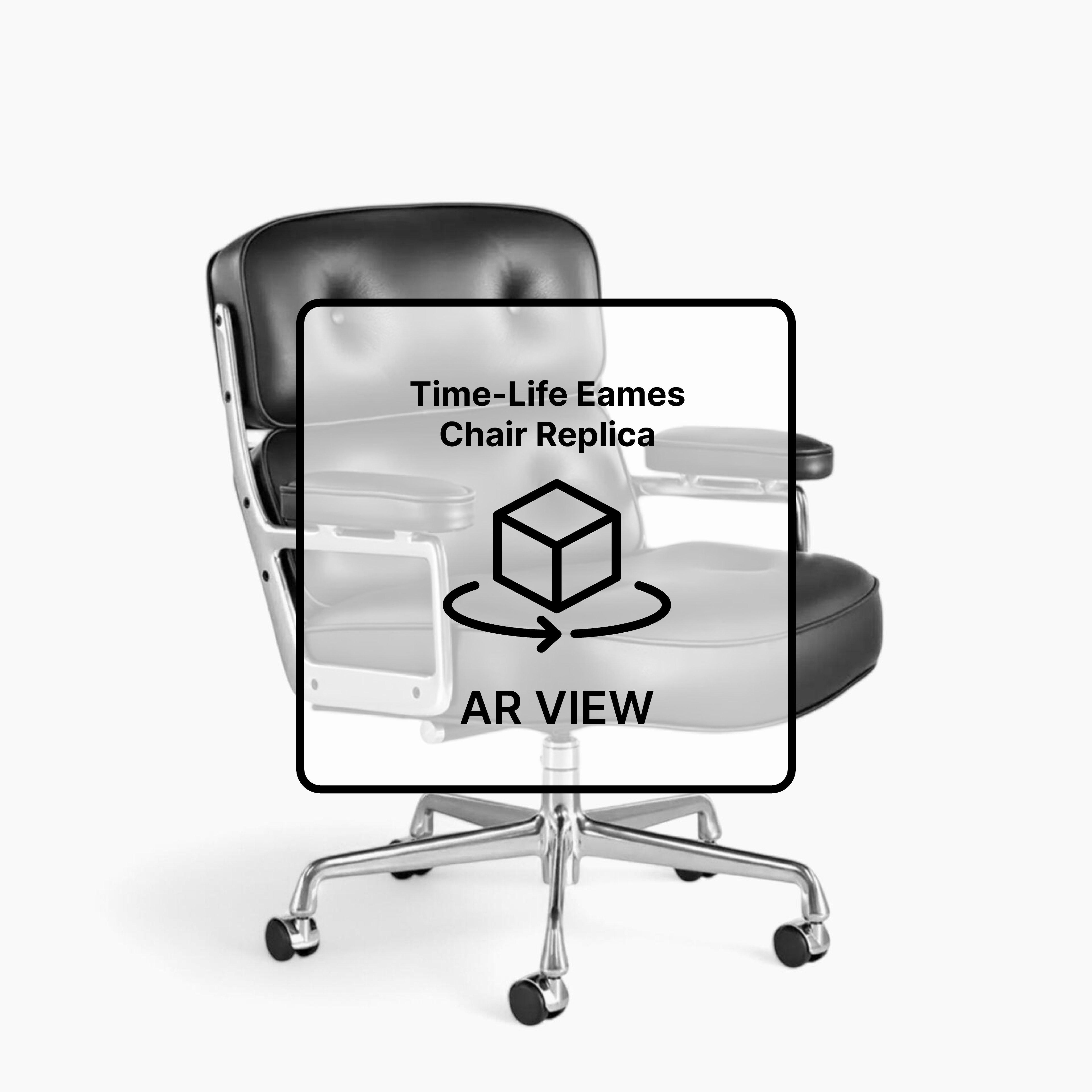
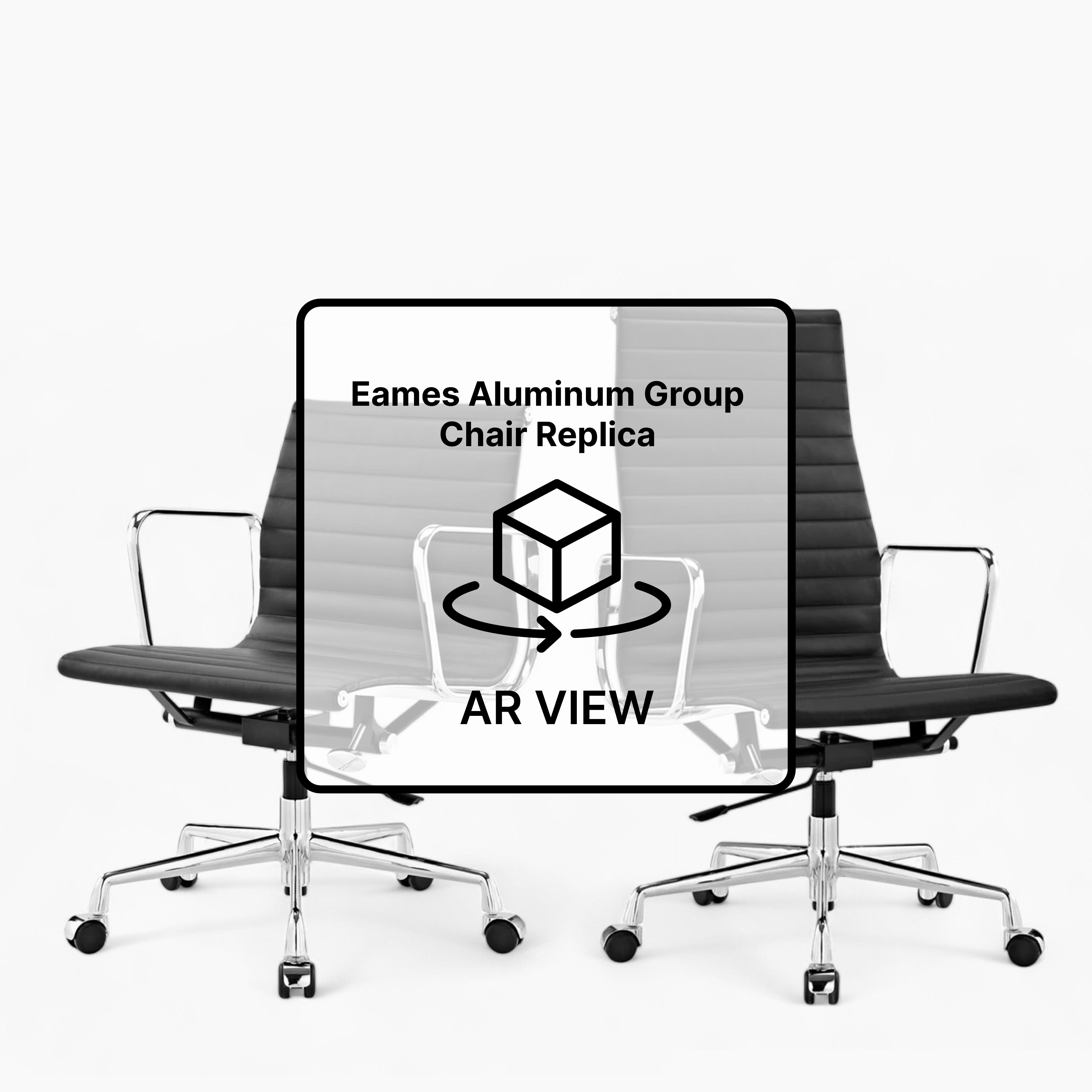
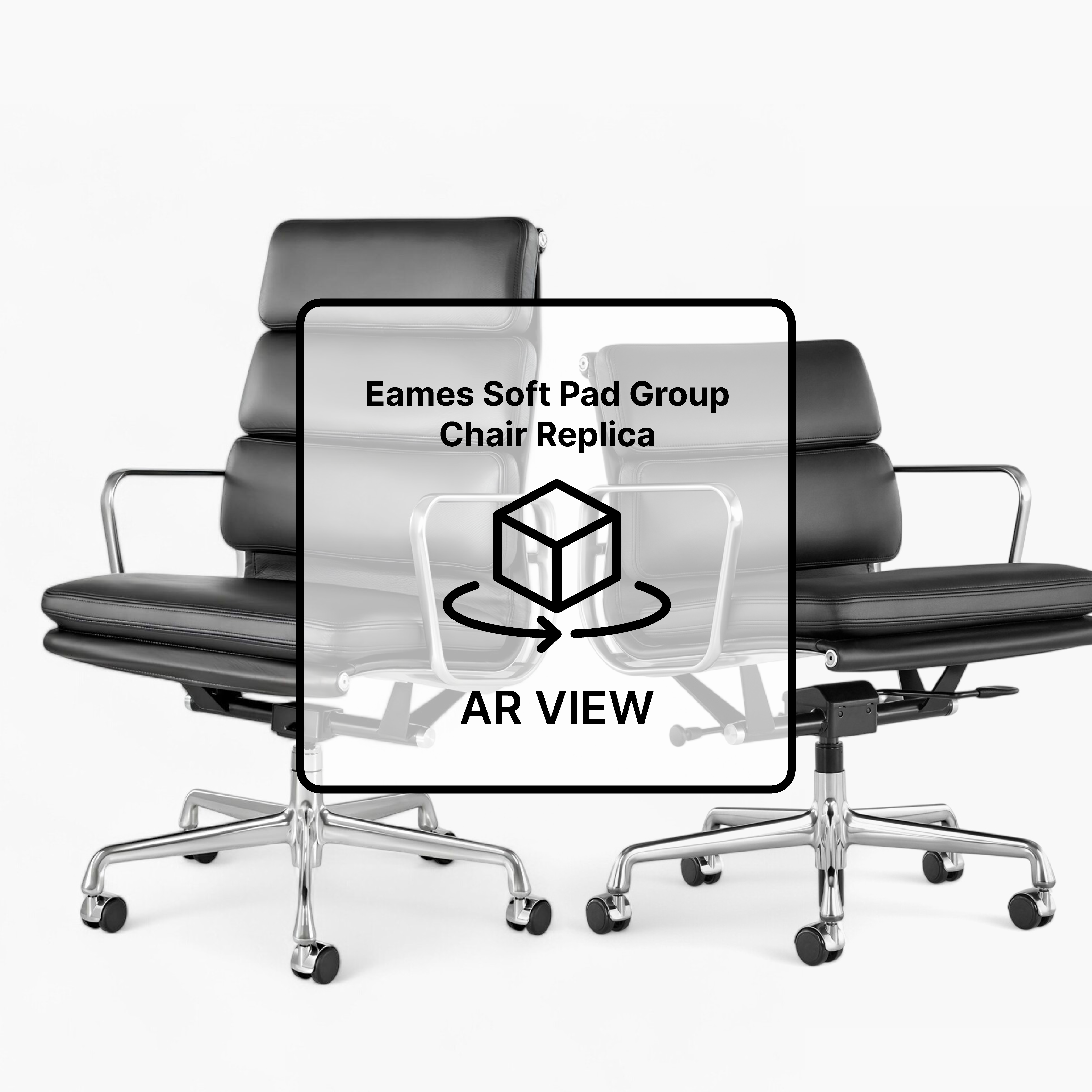
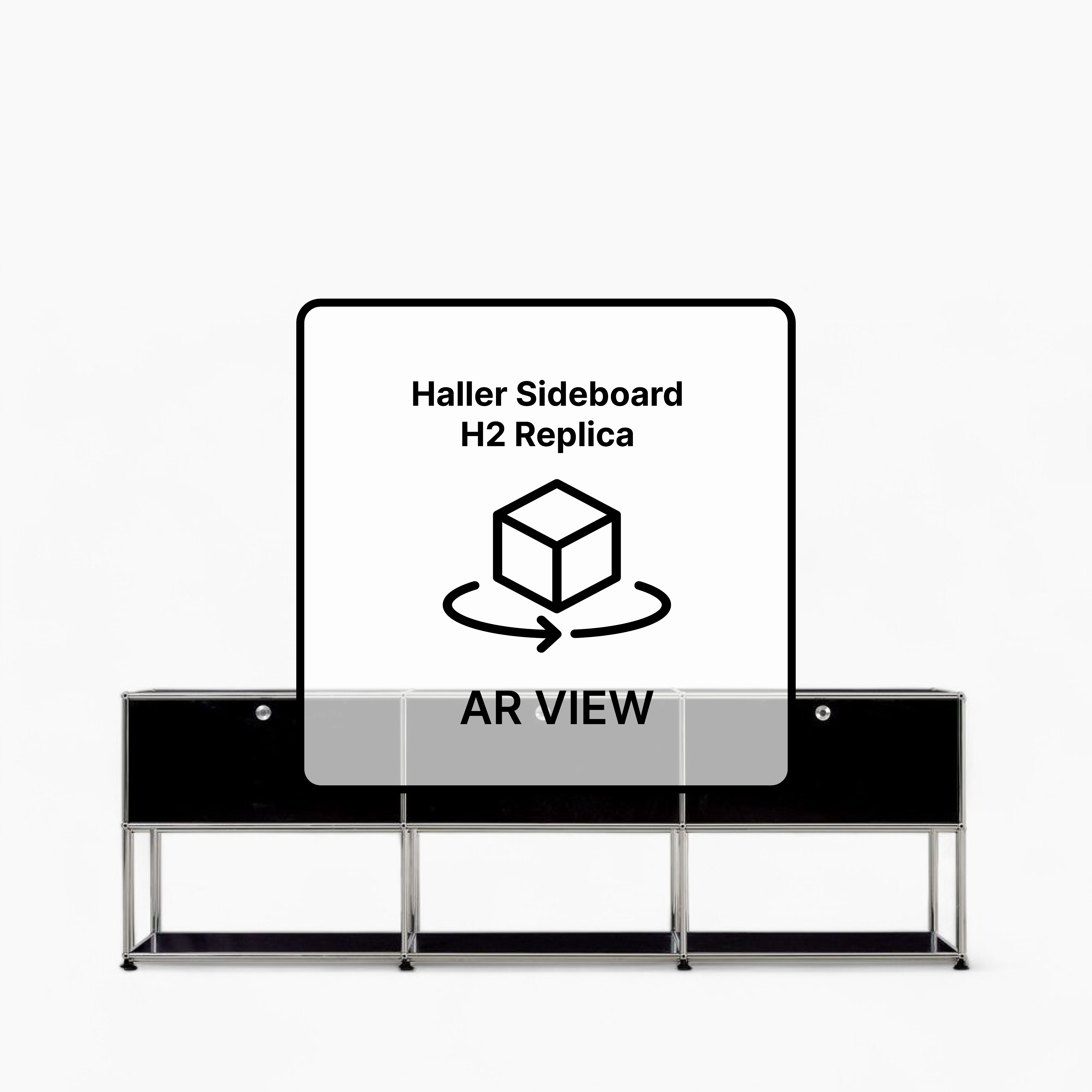
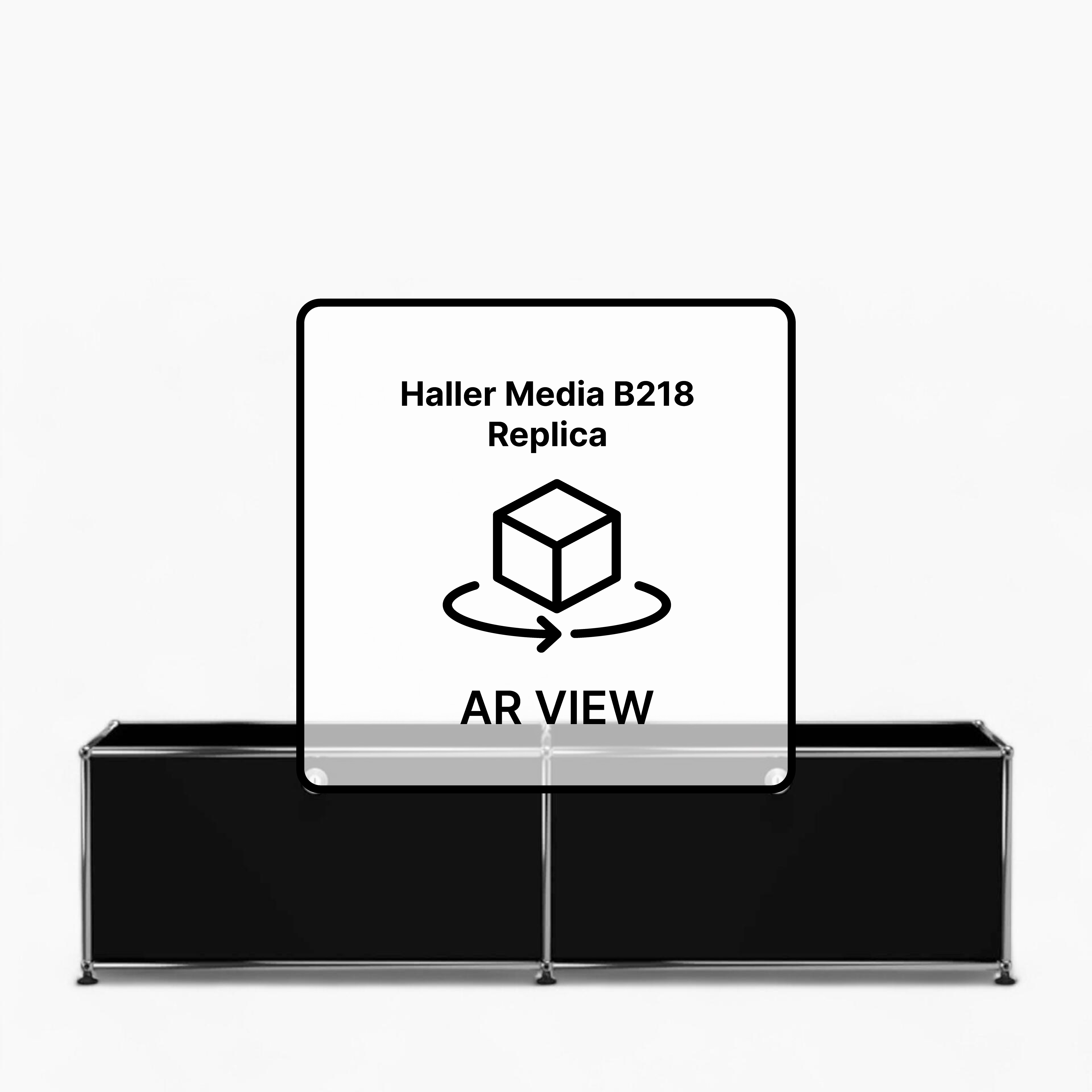
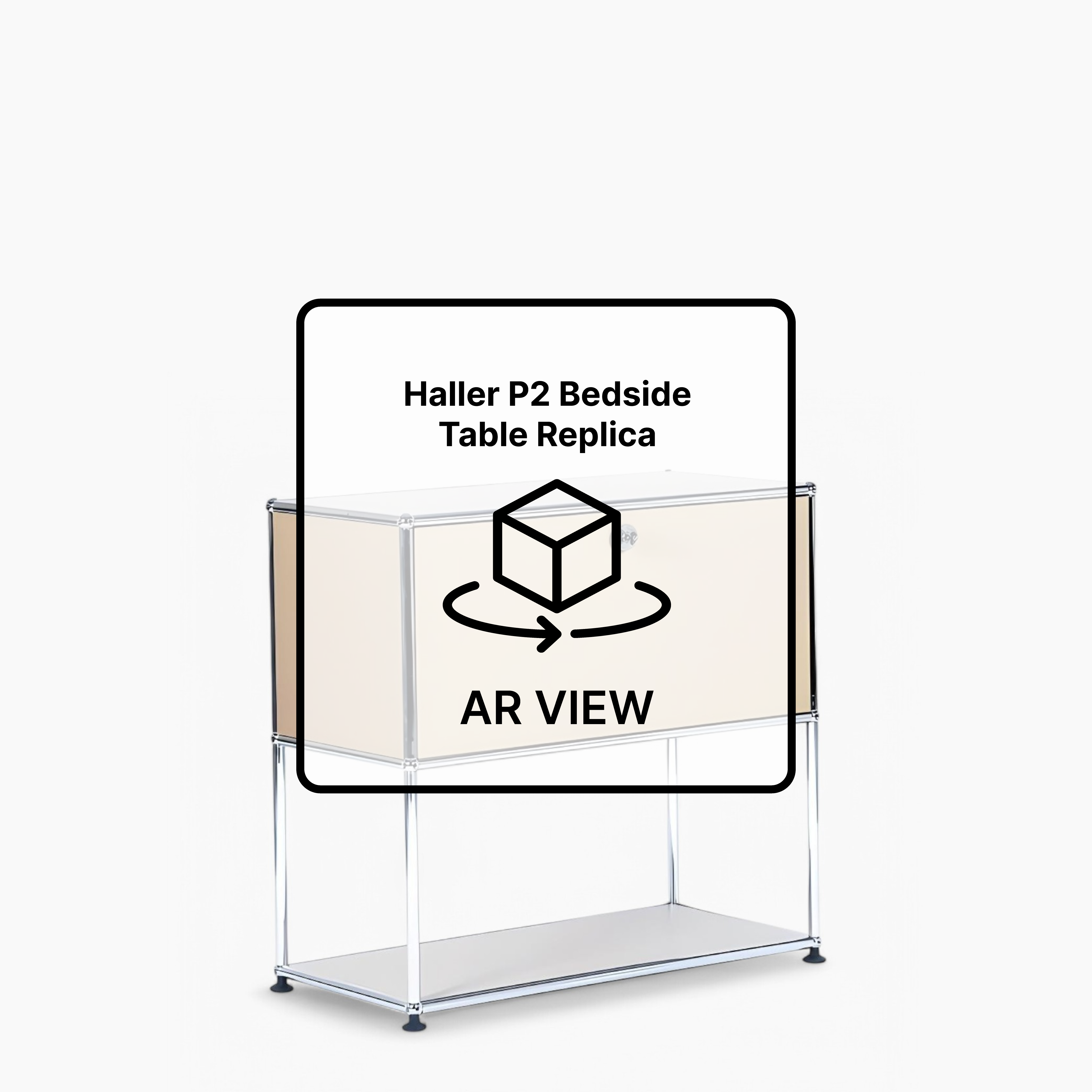
Office AR Gallery
Office
×
See in your room

.qr-section {
position: absolute;
bottom: 60px;
left: 60px;
}
.ar-qr {
width: 100px;
height: 100px;
}
.img-3d {
position: relative;
width: 100%;
height: auto;
cursor: pointer;
}
.custom-modal {
display: none;
position: fixed;
z-index: 2147483647 !important;
left: 0;
top: 0;
width: 100%;
height: 100%;
overflow: hidden;
background-color: rgb(0, 0, 0);
background-color: rgba(0, 0, 0, 0.4);
}
.custom-modal-content {
z-index: 2147483647 !important;
background-color: #fefefe;
margin: 15% auto;
padding: 20px;
border: 1px solid #888;
width: 80%;
position: relative;
}
.custom-close {
color: #aaa;
float: right;
font-size: 28px;
font-weight: bold;
}
.custom-close:hover,
.custom-close:focus {
color: black;
text-decoration: none;
cursor: pointer;
}
.custom-iframe {
z-index: 2147483647 !important;
border: none;
height: 400px;
width: 600px;
display: block;
margin: 0 auto;
box-shadow: 0px 4px 8px rgba(0, 0, 0, 0.1);
border-radius: 8px;
}
.container-btn-custom {
display: flex;
align-items: center;
justify-content: center;
width: 400px;
margin-top: 12px;
}
.btn-3d {
display: flex;
align-items: center;
justify-content: center;
max-height: 44px;
height: 44px;
padding: 0 1.5rem;
border-radius: 64px;
background-color: black;
color: white !important;
margin: 0px 0;
}
.btn-ar {
display: flex;
align-items: center;
justify-content: center;
max-height: 44px;
height: 44px;
padding: 0 1.5rem;
border-radius: 64px;
background-color: white;
color: black !important;
margin: 0px 0;
}
.icon-3d {
width: 30px;
margin-right: 8px;
}
.text-3d {
text-decoration: none;
color: white !important;
}
.text-ar {
text-decoration: none;
color: #001780 !important;
}
.icon-ar {
width: 30px;
margin-right: 8px;
}
body.modal-open {
overflow: hidden;
}
@media only screen and (max-width: 768px) {
.btn-3d {
display: flex;
align-items: center;
justify-content: center;
max-height: 44px;
height: 44px;
padding: 0 1.5rem;
border-radius: 64px;
background-color: black;
color: white !important;
margin-top: 20px;
border: 1px solid black;
width: 50%;
}
.icon-3d {
width: 20px;
margin-right: 8px;
}
.text-3d {
text-decoration: none;
color: white !important;
}
.btn-ar {
display: flex;
align-items: center;
justify-content: center;
max-height: 44px;
height: 44px;
padding: 0 1.5rem;
border-radius: 64px;
background-color: white;
color: black !important;
margin-top: 20px;
width: 50%;
}
.icon-ar {
width: 20px;
margin-right: 8px;
}
.text-ar {
text-decoration: none;
color: black !important;
}
}
@media screen and (min-width: 1025px) and (max-width: 1440px) {
.custom-modal-content {
margin: 2% auto !important;
}
}
@media screen and (max-width: 1024px) {
.qr-section {
display: none;
}
}
/*buat tablet*/
@media screen and (min-width: 426px) and (max-width: 1024px) {
.img-3d {
width: 100%;
height: auto;
}
}
/*buat mobile*/
@media screen and (max-width: 767px) {
.img-3d {
width: 100%;
height: auto;
}
}