Sohnne AR Gallery
AR Gallery
Like it, love it, or just want to try it out?
View it in your home with AR (Augmented Reality), right from your device.
.container-ar {
width: 100%;
/*max-width: 1200px;*/
margin: 0 auto;
}
/*@media (max-width: 1024px) {*/
/* .container {*/
/* padding-left: 16px;*/
/* padding-right: 16px;*/
/* }*/
/*}*/
.row-ar {
display: flex;
width: 100% !important;
}
.col-left {
width: 50%;
padding-right: 10px;
}
.col-right {
width: 50%;
padding-left: 10px;
}
.room-container {
position: relative;
overflow: hidden;
height: 100%;
margin-bottom: 20px;
}
.big-room {
height: 600px;
}
.small-room {
height: 290px;
}
.room-img {
aspect-ratio: 16/9;
width: 100%;
height: 100% !important;
object-position: bottom;
object-fit: cover;
}
.col-right .room-img {
object-position: center;
}
.room-overlay {
position: absolute;
bottom: 0;
left: -100%;
width: 100%;
height: 100%;
background-color: rgba(0, 0, 0, 0.5);
display: flex;
align-items: center;
justify-content: flex-start;
transition: left 0.35s cubic-bezier(0.25, 0.1, 0.6, 1);
}
.img-text {
position: absolute;
left: 16px;
bottom: 24px;
color: white;
}
.img-text h2 {
color: white;
}
.room-container:hover .room-overlay {
left: 0;
}
.room-container:hover .img-text {
display: none;
}
.overlay-content {
display: flex;
flex-direction: column;
align-items: flex-start;
justify-content: center;
text-align: left;
padding-left: 40px;
}
.room-title {
color: white !important;
font-size: 30px;
margin-bottom: 20px;
}
.room-button {
background-color: white;
color: black;
border: none;
padding: 10px 20px;
font-size: 15px;
cursor: pointer;
transition: all 0.3s ease;
}
.room-button:hover {
background-color: #f0f0f0;
transform: scale(1.05);
}
a.room-container {
text-decoration: none;
display: block;
cursor: pointer;
}
/* Mobile adjustments for overlay content */
@media (max-width: 768px) {
.overlay-content {
padding-left: 30px;
}
.room-title {
font-size: 24px;
margin-bottom: 15px;
}
.room-button {
font-size: 13px;
}
}
/* Responsive columns for tablet and mobile */
@media (max-width: 1024px) {
.row-ar {
flex-direction: column;
}
.room-img {
aspect-ratio: 16/9;
}
.col-left,
.col-right {
width: 100%;
padding: 0;
}
.big-room,
.small-room {
height: 250px;
margin-bottom: 20px;
}
}
@media (min-width: 1024px) {
.row-ar .col-left .room-img {
aspect-ratio: 1/1;
}
}
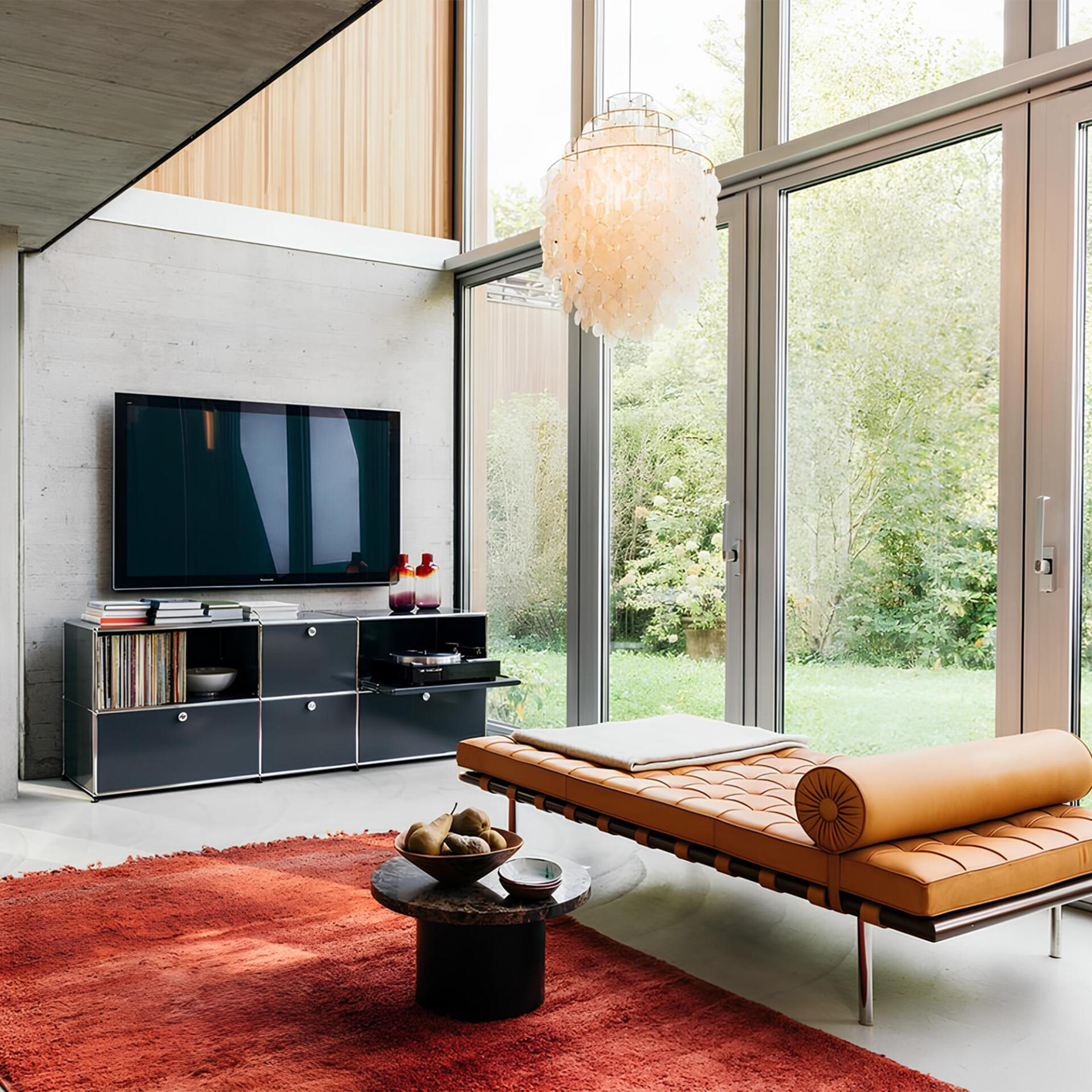
Living Room
Living Room
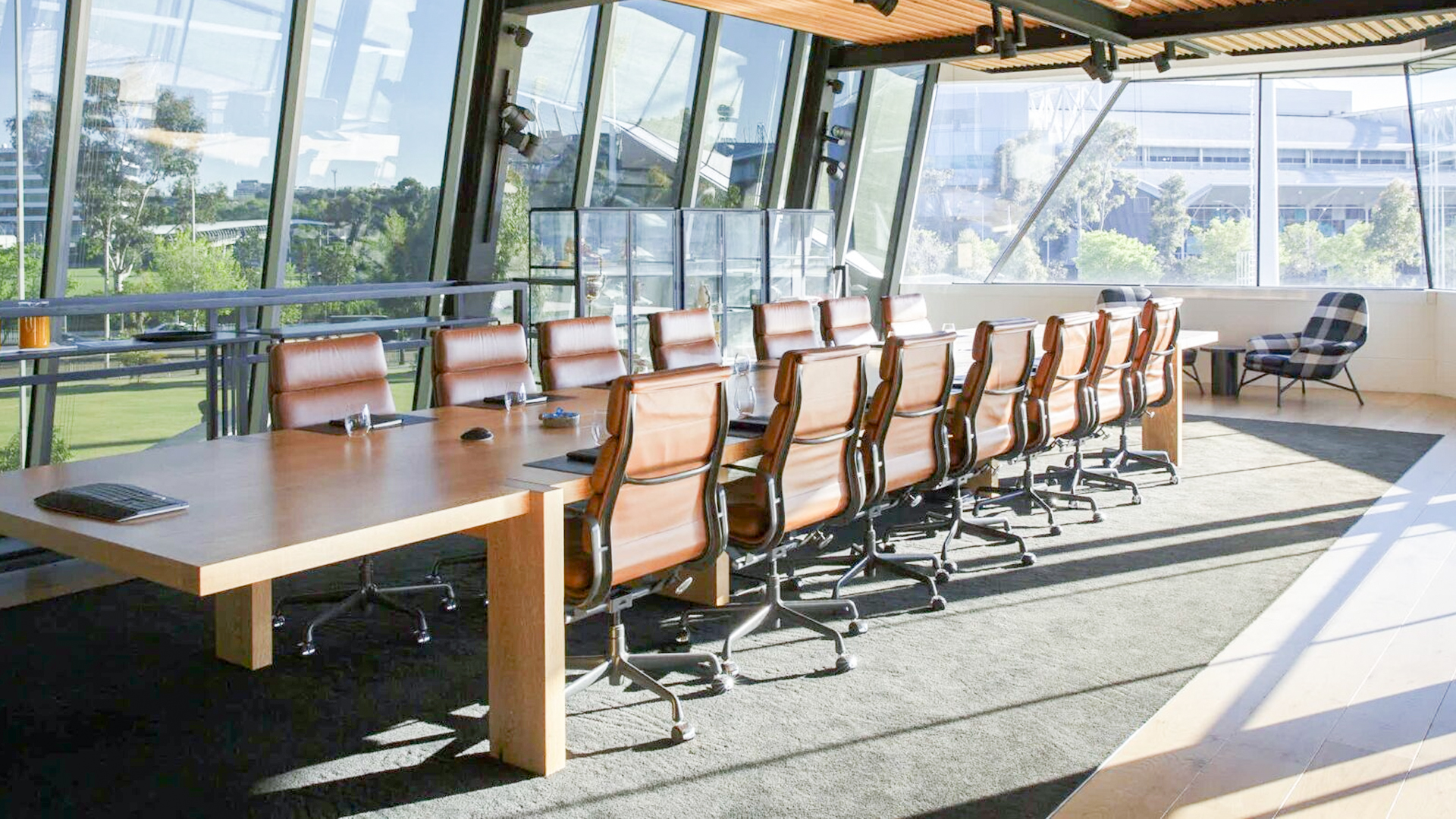
Office
Office
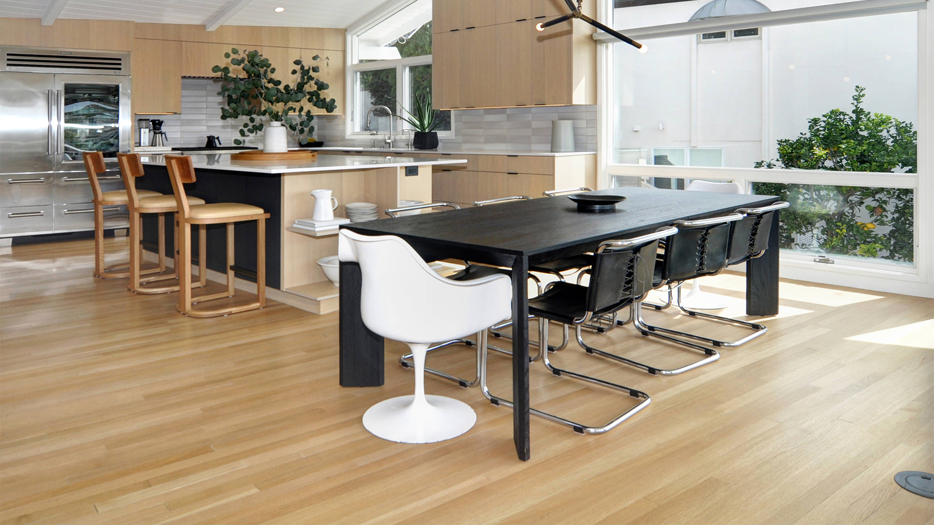
Dining Room
Dining Room