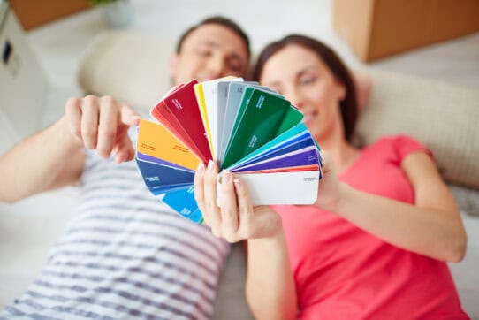
Color is the first thing you feel when you walk into a room. Before the furniture, before the light, it is color that sets the tone. A thoughtful home decor color palette does more than decorate walls. It defines how you live in a space.
Choosing the right colors can feel like walking into a paint aisle with no exit. The key is not copying what looks pretty online. The key is understanding how color behaves, what it says about you, and how it works within your rooms.
This is a practical guide to building a palette that feels cohesive, intentional, and timeless.
Start with Mood

Every great design begins with a feeling. Ask yourself what emotion you want the room to hold.
Color psychology supports this approach. Certain hues influence energy, focus, and relaxation. Soft greens and blues calm the mind. Terracotta and mustard tones create warmth and connection.
- Bedrooms. Use sage, pale gray, or muted blue for rest.
- Living rooms. Warm neutrals and amber tones invite conversation.
- Home offices. Deep olive or slate blue sharpen focus.
Pro tip: Look at your favorite movie scenes. In Her, soft coral tones reflect intimacy and calm. In The Grand Budapest Hotel, layered pastels and warm symmetry create balance and nostalgic charm. That is mood translated into color.
Follow the 60-30-10 Rule

This classic design ratio gives every home decor color palette structure.
- 60 percent main color for walls, large rugs, or big furniture
- 30 percent secondary color for sofas, curtains, and big accents
- 10 percent accent color for pillows, lamps, and small decor
Think of it as composing music. The base note grounds the space. The midtones add rhythm. The accents provide the hook.
Pro tip: If the room feels off, the 10 percent accent may be too strong or scattered. Keep accents consistent in tone and repeat them across the room.
Learn Simple Color Theory

Color theory is just how colors relate. Once you know the basic relationships, you can make rooms flow.
- Analogous colors sit next to each other on the wheel. They produce harmony, for example beige, peach, and coral.
- Complementary colors sit opposite each other. They create contrast, for example navy and rust.
- Monochromatic schemes use one hue in varying shades. They feel calm and refined.
Pro tip: Mix one cool tone and one warm tone in every room. That balance keeps spaces from feeling flat or over coordinated.
Read more: How to Pick a Front Door Color: A Guide on Making an Entrance
Use Seasonal Color Families to Start Fast

If you want a quick way to build a flattering base, use seasonal color families. These are palettes grouped by the overall warmth, brightness, and depth that tend to feel natural with different light and materials.
- Spring palettes favor warm, clear tones and fresh pastels. They suit lively, airy rooms.
- Summer palettes use soft, cool pastels and muted blues. They work well in serene bedrooms and coastal styles.
- Autumn palettes center on rich earth tones like rust, olive, and deep gold. They feel cozy and grounded.
- Winter palettes rely on high contrast and clear, saturated tones. They are dramatic and modern.
Pro tip: Pick the season that best matches your light and furniture finishes. Use that season as a shorthand for choosing base and secondary colors.
Let Pop Culture Guide Your Eye

Look to film and television for finished color stories. Set designers intentionally choose palettes to reflect mood and character.
- Barbie pushed playful, saturated pinks and bright whites that translated quickly into a trend.
- Parasite used muted concrete grays and green tones to create tension and calm at the same time.
- La La Land used saturated primaries to capture emotion and nostalgia.
Pop culture can show you how palettes feel in real settings. Use those scenes as mood boards, not templates.
Layer Texture Instead of Adding More Color

You do not need ten colors for depth. You need texture.
Pair linen with matte ceramics, boucle with wood grain, or leather with brushed metal. Texture gives your interior design color palette movement and richness without visual clutter.
Pro tip: Keep your main color neutral, then build contrast through materials. A beige sofa next to a rough stone wall or a cream rug beside glossy black accents creates quiet depth that still feels clean.
Test Colors in Real Light

Colors change with light. A paint that reads soft white in the showroom can look yellow in your living room lamp.
Always sample paint on large boards and move them through your space. Observe them in morning light, midday, and evening.
Pro tip: Use a foam board with large swatches and live with it for a week before committing.
Let the Palette Evolve

Your home decor color palette should grow with you. Swap accents by season. Lighter fabrics and pastels in summer, deeper tones and metallics in winter. The goal is refresh, not redo.
Pro tip: Keep a base palette of three consistent tones across your home. This creates flow and makes seasonal updates effortless.
Avoid Common Pairing Mistakes

Some color pairings often read dated or jarring, especially when used at full saturation. Design experts commonly avoid certain combos because they tend to feel forced.
- Navy and coral often read juvenile at full saturation. Consider midnight blue with rust instead.
- Brown and burgundy can feel heavy and dated. Try layering rich browns with warm ochres.
- High contrast red and black can feel aggressive in a home. Replace one with a deeper, muted alternative.
- Neon red paired with lemon yellow often feels jarring. Try rust and ochre for an earthy warmth.
Pro tip: If a bold pairing tempts you, mute one of the tones or swap to a deeper variant. Subtlety often reads as sophistication.
Try the Unexpected Red Trick

One well placed red accent can lift a neutral palette. A lamp, a pillow, or a small chair in a warm red creates a focal point and gives the room energy.
Pro tip: If red feels too intense, use rust, clay, or burgundy. They deliver warmth with less contrast.
Build for Longevity

Trends come and go. The most successful home decor color palettes are built on proportion, emotion, and light rather than novelty.
Start with mood. Use structure like the 60-30-10 rule. Test under your light. Let texture bring depth. Then give your palette room to breathe.
Pro tip: Choose colors that read well in daylight and under warm evening light. That balance keeps your palette relevant through seasons and trends.
When you understand your colors, how they interact, how they shift with light, and how they make you feel, your home becomes more than just decorated. It becomes a reflection of you — calm, confident, and intentional.
At Sohnne, every piece is designed to work in harmony with your home decor color palette. From soft neutrals to deep, moody tones, our furniture and textiles bring balance, comfort, and quiet elegance to any space.
Explore our collection and bring timeless balance into your home for elevated living.